India picks symbol to rival the €£¥$
For those of us still fumbling to find the € symbol on our keyboards, today was a bad news day. Computer and mobile keyboards in India (and possibly around the globe) will soon be adding another new button - the rupee key.
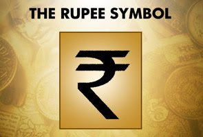
Today a jury selected by the Indian government unveiled a new rupee symbol (pictured) to rival the internationally recognised the US dollar ($), the euro (€), the UK pound (£) and the Japanese Yen (¥).
The decision to create a new currency symbol reflects India’s aspiration to become a global player on international financial markets, in particular at a time when the Indian rupee has been strengthening against all major currencies.
The new symbol - or logo as some people have called it - also aims to distinguish India from its neighbours. Pakistan, Nepal and Sri Lanka all currently use the “Rs” abbreviation to refer to the their local rupee.
Earlier this year Pranab Mukherjee, India’s finance minister, said that the government “intends to formalise a symbol for the Indian rupee, which reflects and captures the Indian ethos and culture”.
So, in classic Indian style, the ministry organised an open competition to design the new symbol. The prize set for the winner was Rs250,000 ($5,352) in cash.
And the winner was…Udaya Kumar, a post-graduate student at Mumbai’s Industrial Design Centre, which is part of one of India’s elite institutes of technology (IITs).
For those who think it looks a bit like an ‘R’ with a line across it, don’t be fooled. According to the Indian Express the new symbol represents exactly what the finance minister was looking for.
“An amalgam of the Devanagari ‘Ra’ and the Roman capital ‘R’ without the stem…. [it] is based on the Tricolour and “arithmetic equivalence”. While the white space between the two horizontal lines gives the impression of the national flag with the Ashok Chakra, the two bold parallel lines stand for ‘equals to’, representing balance in the economy, both within and with other economies of the world.”
The verdict was given by a five-member jury and approved by the government cabinet’s today. However, the more important question is whether Indian citizens will like it. Beyondbrics hit the streets of Mumbai, India’s financial capital, with a copy of the new rupee symbol to gauge reaction to the currency’s novel design.
The (unscientific) beyondbrics vox pop verdict was generally a thumbs up for the new design - 6 out of the 10 people interviewed said they liked the currency symbol. The most common comment was that it merged India’s traditional and modern ethos.
Salman Borbhuyan, a perfume shop owner, said: “I like it because it has a traditional feel and a modern look. It’s a great mix.”
Another fan of the new “logo” Nitin Hadale, a young gym trainer, said: “It has an aggressive look and it’s very eye-catching.”
Two people agreed that the new symbol had a lot in common with the euro. However, the same two were split on whether the euro-likeness was a good thing.
A cigarette vendor, who didn’t want to be named, said: “I don’t like the fact that it looks like a euro…the symbol should be more Indian.”
However, Mukesh, a tailor, said that “the similarity with the euro is positive…it will make the rupee more internationally recognisable.”
What the majority of the country thinks about this new symbol is still a mystery - very few have seen the symbol or were aware that the government was planning to create a new one. An appropriate marketing campaign will be necessary to get everybody on board to support it.
From a geopolitical point of view, there are some serious doubts on whether the new symbol will help to elevate India’s status in international financial markets. Although the move certainly makes sense, and will bring some visibility to the Indian currency, it will take much more substantial and radical reform for India to enter the circle of global economic superpowers.

No comments:
Post a Comment